Selecting a colour often begins with a chart or fan deck, yet what should be a straightforward design decision can quickly feel like a high-pressure evaluation. Is the red too bold? Is the grey too understated? And will it appear the same on a ten-storey building as it does on a small sample chip?
Choosing the right colour of aluminium composite panel sheet for your facade is crucial. It is the first thing people notice, and it sets the tone for the entire structure. When working with the Alustic Solid Series, you have a massive palette at your fingertips. So, how do you narrow it down?
Here is a simple guide to finding the right hue for your project.
1. Define the Building’s “Personality”
Before you pick a colour, ask yourself: what is this building saying?
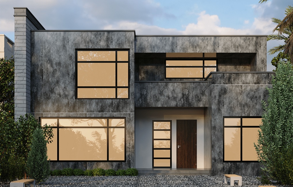
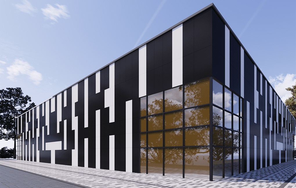
- The Professional Approach: If you are designing a corporate office, a hospital, or an educational institution, you often want to convey trust, stability, and cleanliness. Deep blues, cool silvers, and crisp whites of aluminium wall panels are the gold standard here. They look professional and timeless.
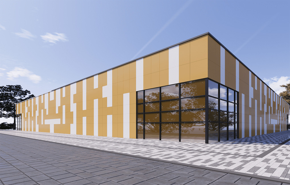
- The Attention Grabber: For a retail store, a fast-food outlet, or a shopping mall, you want energy. You want heads to turn. This is where you can be brave with the vibrant reds, oranges, and yellows found in our Solid Series. These colours stimulate excitement and attract foot traffic.
2. The Art of Mixing Materials
One of the biggest mistakes people make is thinking they have to use just one colour for the whole building. The best designs often come from contrast.
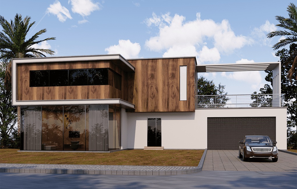
Solid colours look amazing when paired with textured finishes. For example, a modern home clad in a deep Charcoal Grey or Jet Black solid panel looks stunning when accented with the warm, natural tones of the Alustic Wood Series. The solid colour provides a sleek, modern canvas, while the wood finish adds a touch of organic warmth, preventing the design from feeling too cold or industrial.
3. Finish Matters: Matte vs. Gloss
Colour isn’t just about the pigment; it’s also about the reflection. The exact same shade of red can look entirely different depending on whether it absorbs light or reflects it.
- Standard/Matte: Great for residential projects or large corporate facades where you want the colour to look consistent and don’t want blinding glare from the sun.
- High Gloss: If you are designing a showroom, a high-end boutique, or interior signage, consider the Alustic Glossy Series. A high-gloss finish adds a layer of depth and luxury that indicates “premium”. It creates a mirror-like effect that makes small spaces feel larger and brands look more expensive.
4. Consider the Surroundings
Finally, look at where the building sits. Is it in a leafy suburb? Earthy tones or greens might blend in beautifully. Is it in a concrete jungle? You might want a bright pop of colour to stand out, or perhaps a sleek Metallic finish from the Alustic Metal Series to reflect the urban skyline.
Don’t view the building in isolation; view it as part of the streetscape.
Choosing a colour is a personal journey, but with the right strategy, you can ensure your building makes the perfect statement with the best exterior aluminium composite panel.
Ready to find your shade? Browse the full spectrum of possibilities on the Alustic website, and let’s bring your vision to colour!